WONDERTREE
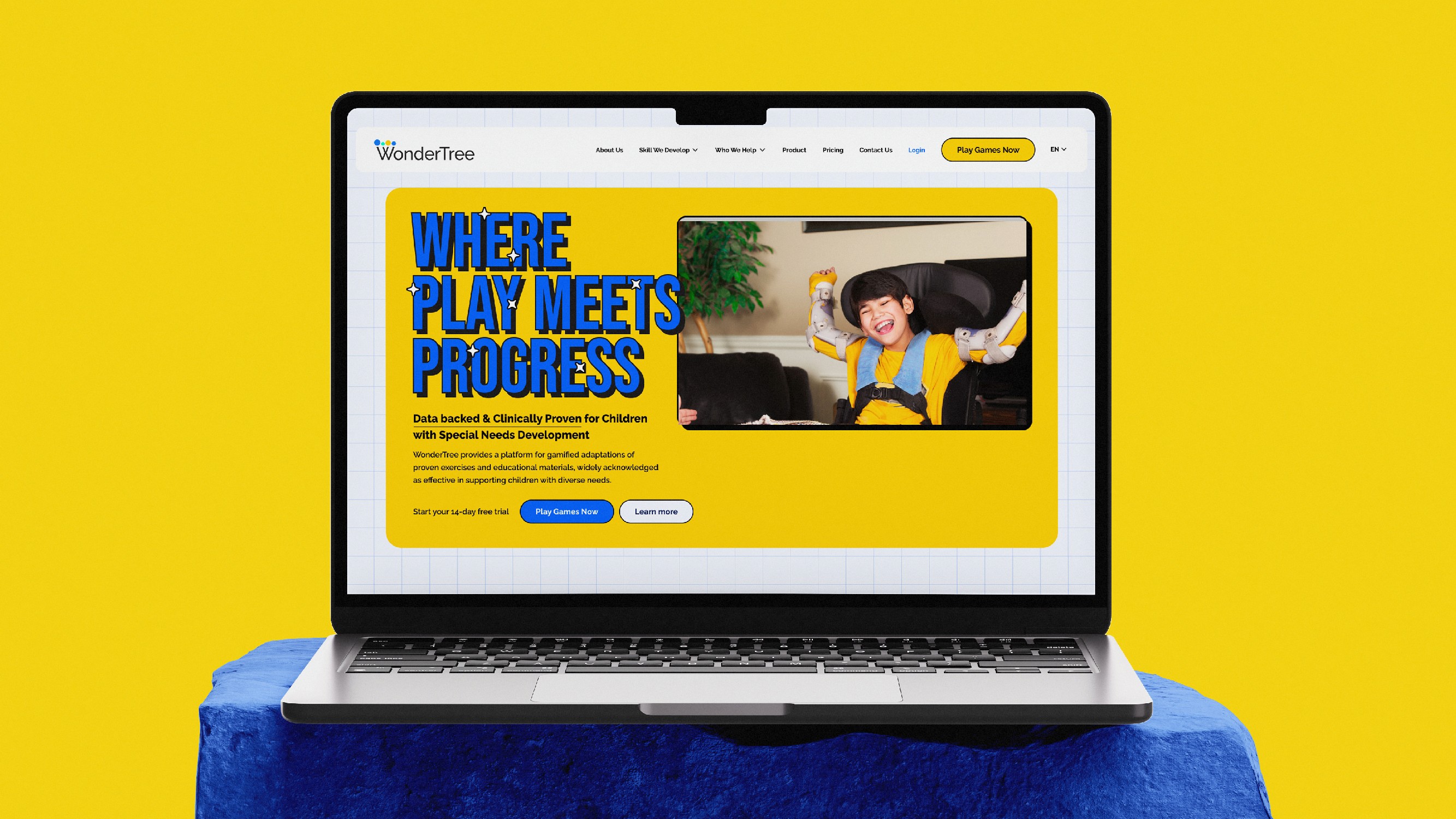
UX research, strategy and redesign for WonderTree, improving the experience from discovery and sign-up to onboarding and first use.
00
Problem
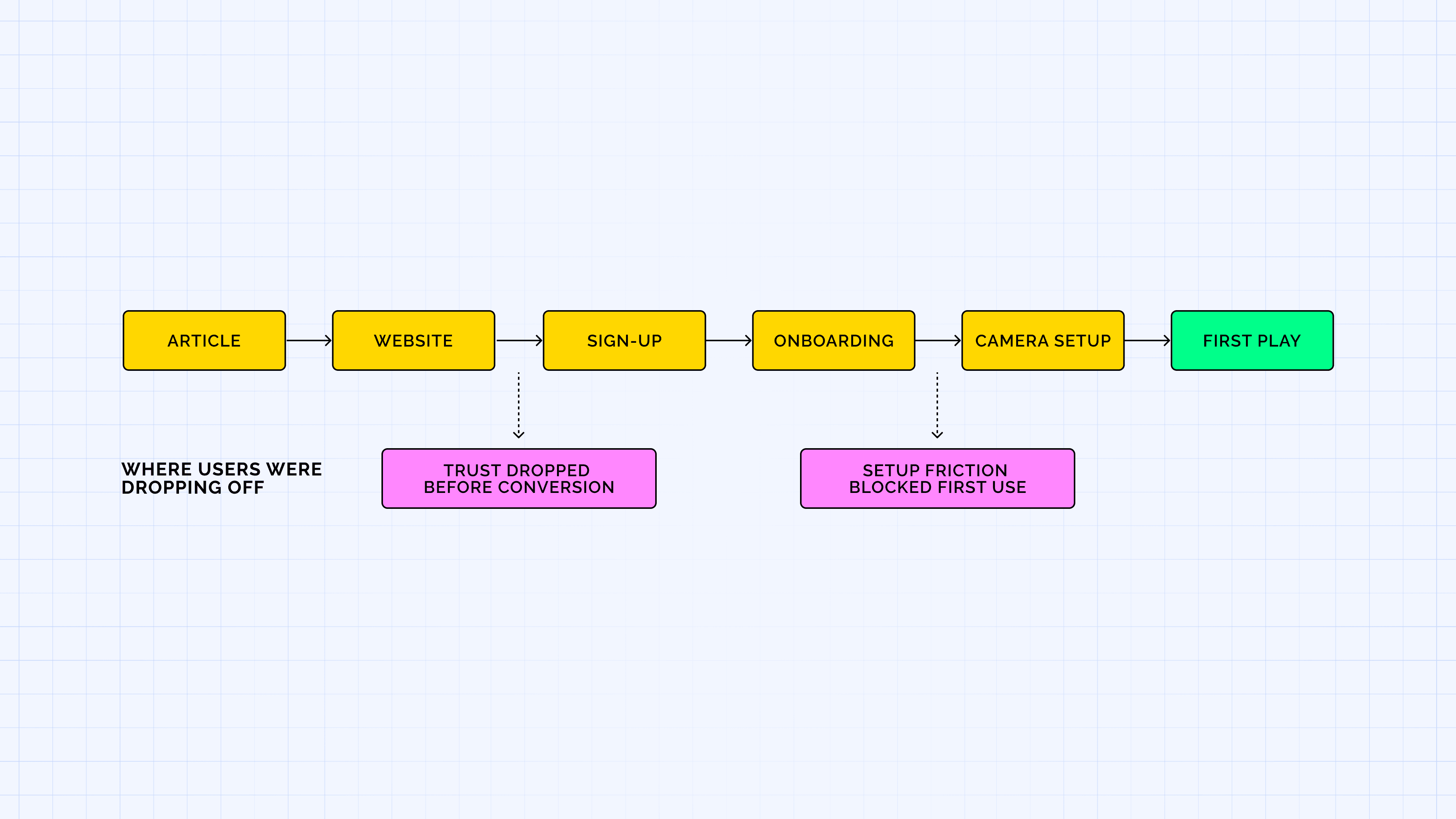
WonderTree was attracting parents through articles about ADHD, autism and other developmental conditions, but many were dropping off before or after signing up. The website didn't build enough trust, while the product had friction that made getting started difficult.
Solution
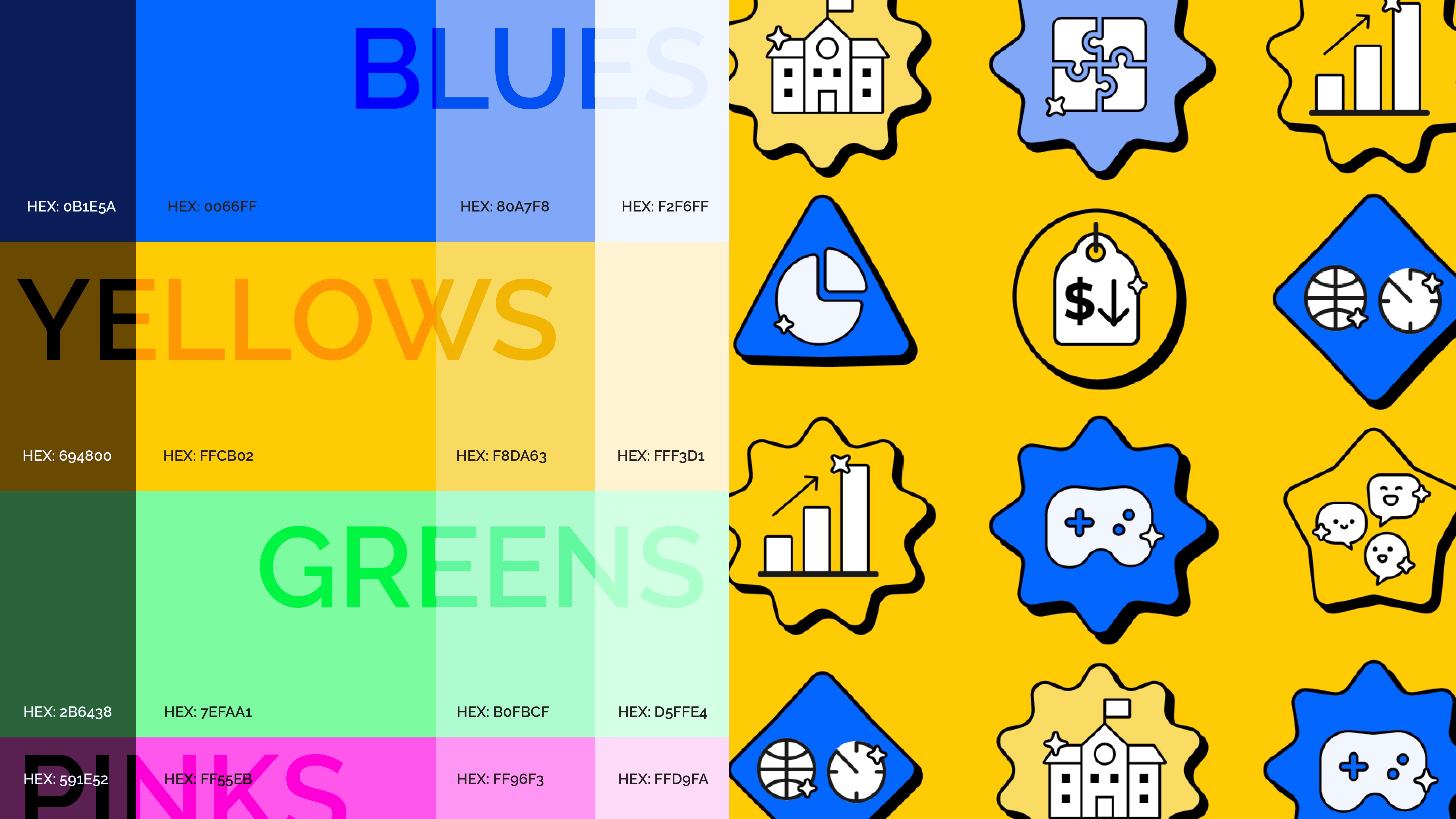
I redesigned the journey across discovery, sign-up, onboarding and first use, refreshing the brand and website, improving information architecture and game discovery, introducing personalized onboarding, and simplifying the setup experience. My Role: Lead Product Designer | UX research, UX strategy, information architecture, interaction design and UI. I led the UX and visual redesign across the website and product experience. I collaborated with another designer on the report-generation experience and worked with an illustrator to develop the visual assets and illustration system.
Where the journey broke
WonderTree already had an audience. The problem was what happened after people arrived.
I used analytics and user research to understand where users were dropping off and found two major gaps: trust before sign-up and product friction after sign-up.
The website didn't reflect the credibility of an eight-year-old product, while camera connectivity and a confusing product journey made it harder for new users to reach their first play experience.
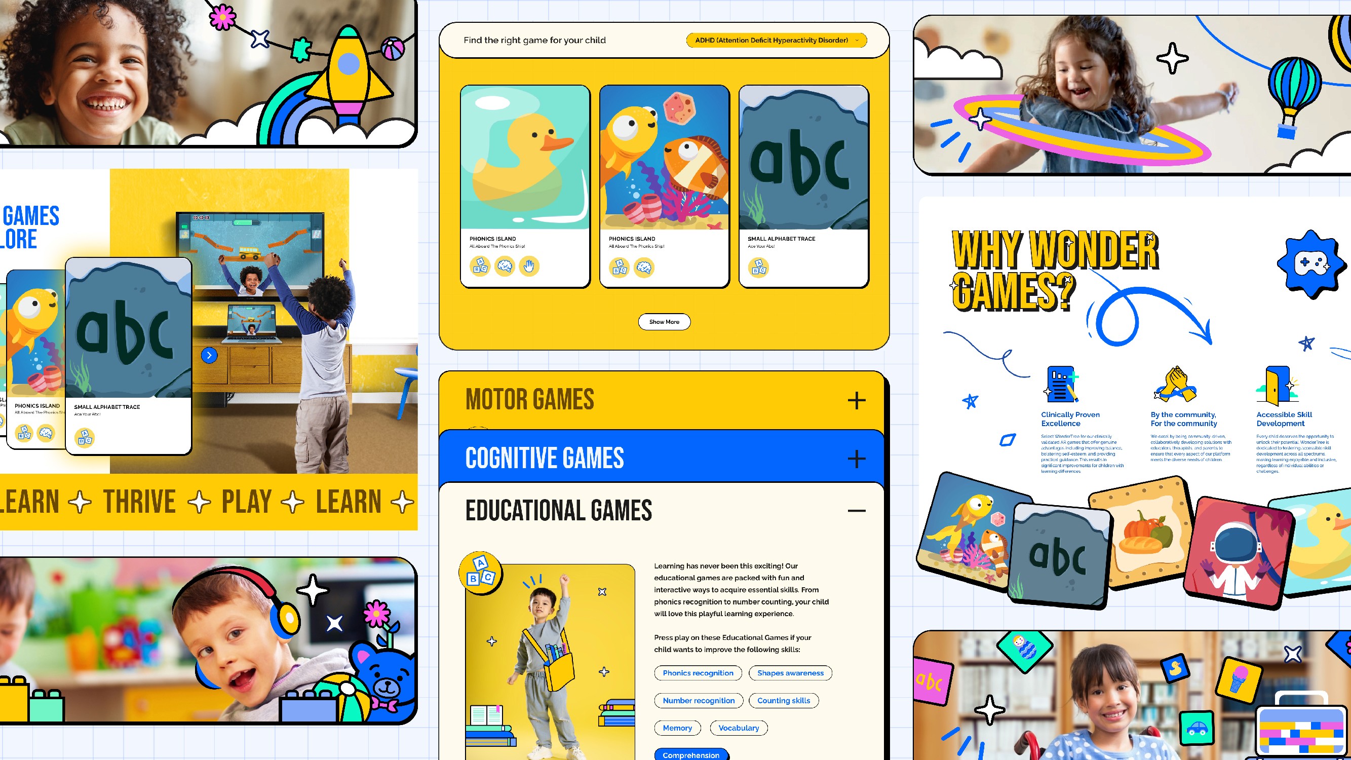
Helping parents find the right information
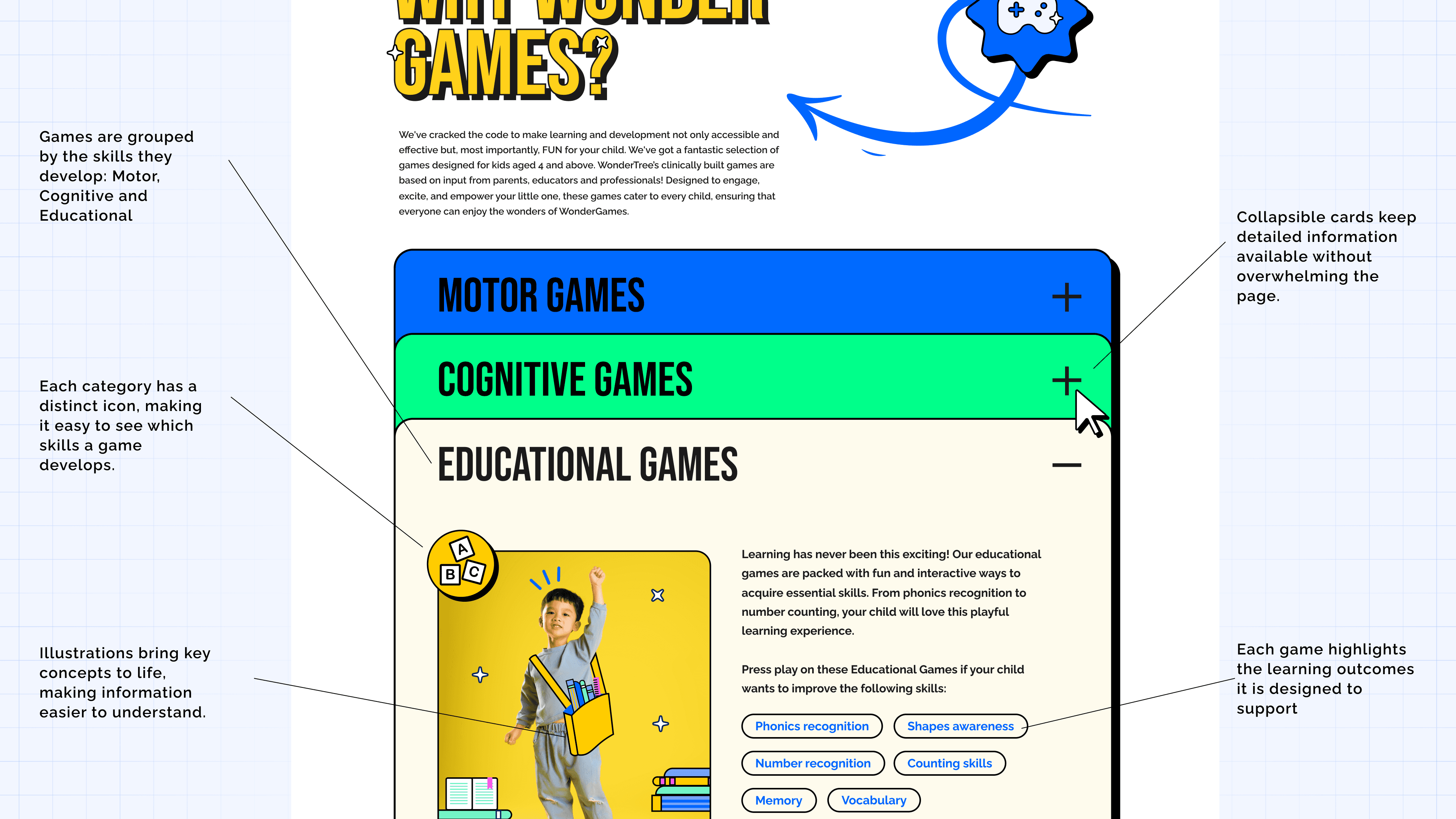
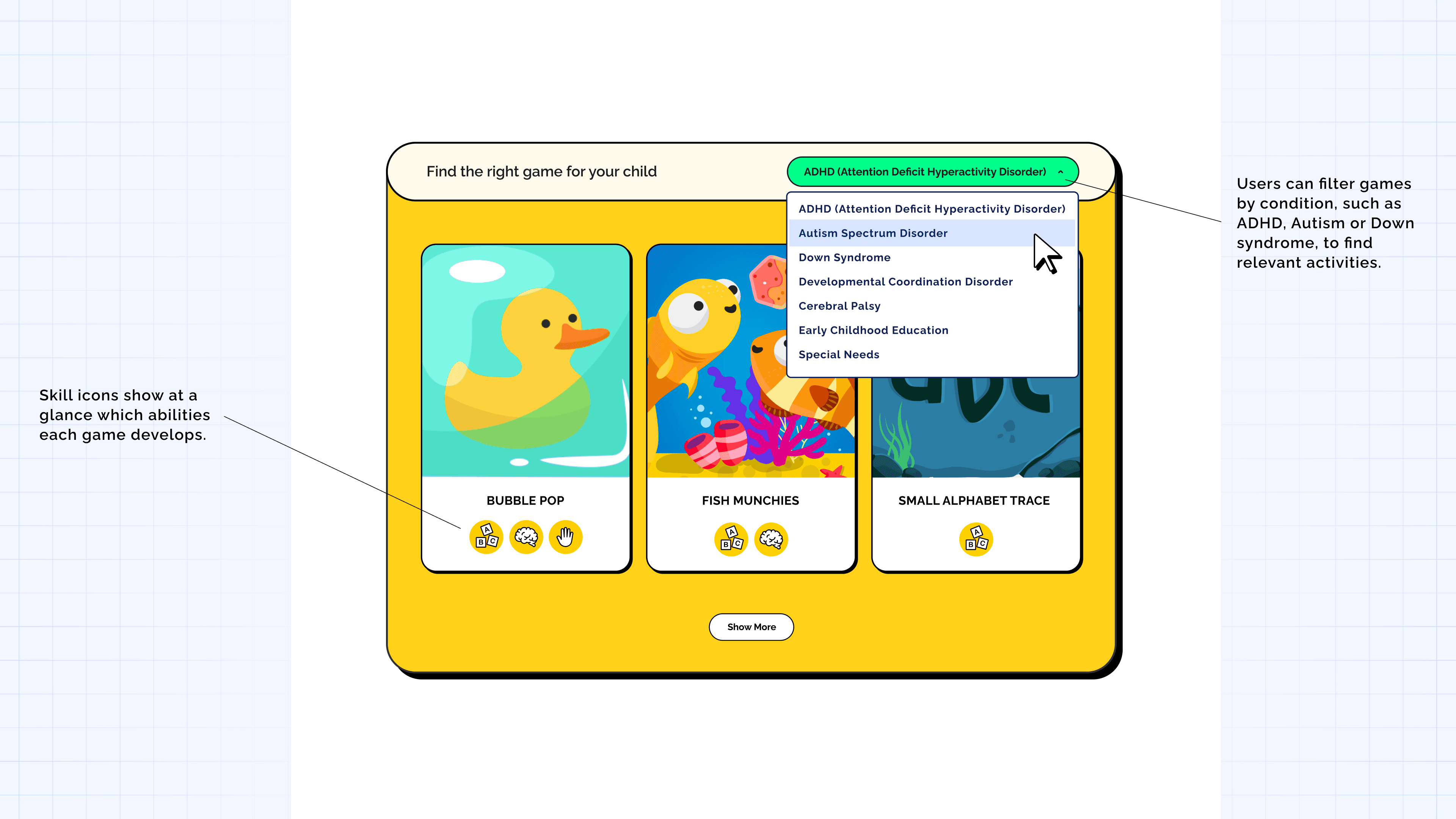
Parents wanted to understand the product before committing to it. The challenge was giving them enough detail without making the experience overwhelming.
I reworked the information architecture around the questions parents were already asking, making it easier to explore conditions, skills and individual games.
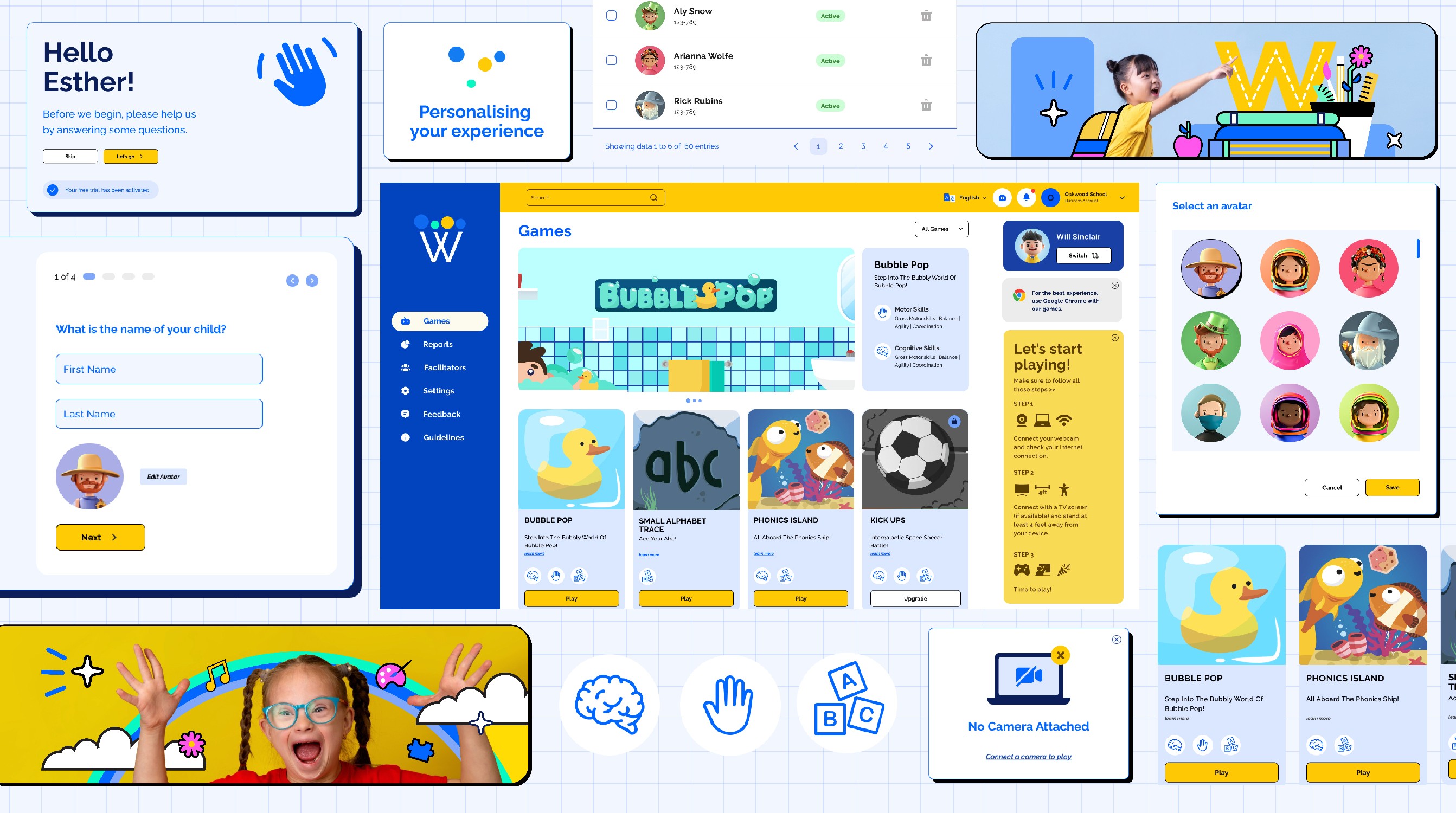
Designing the first experience around the child
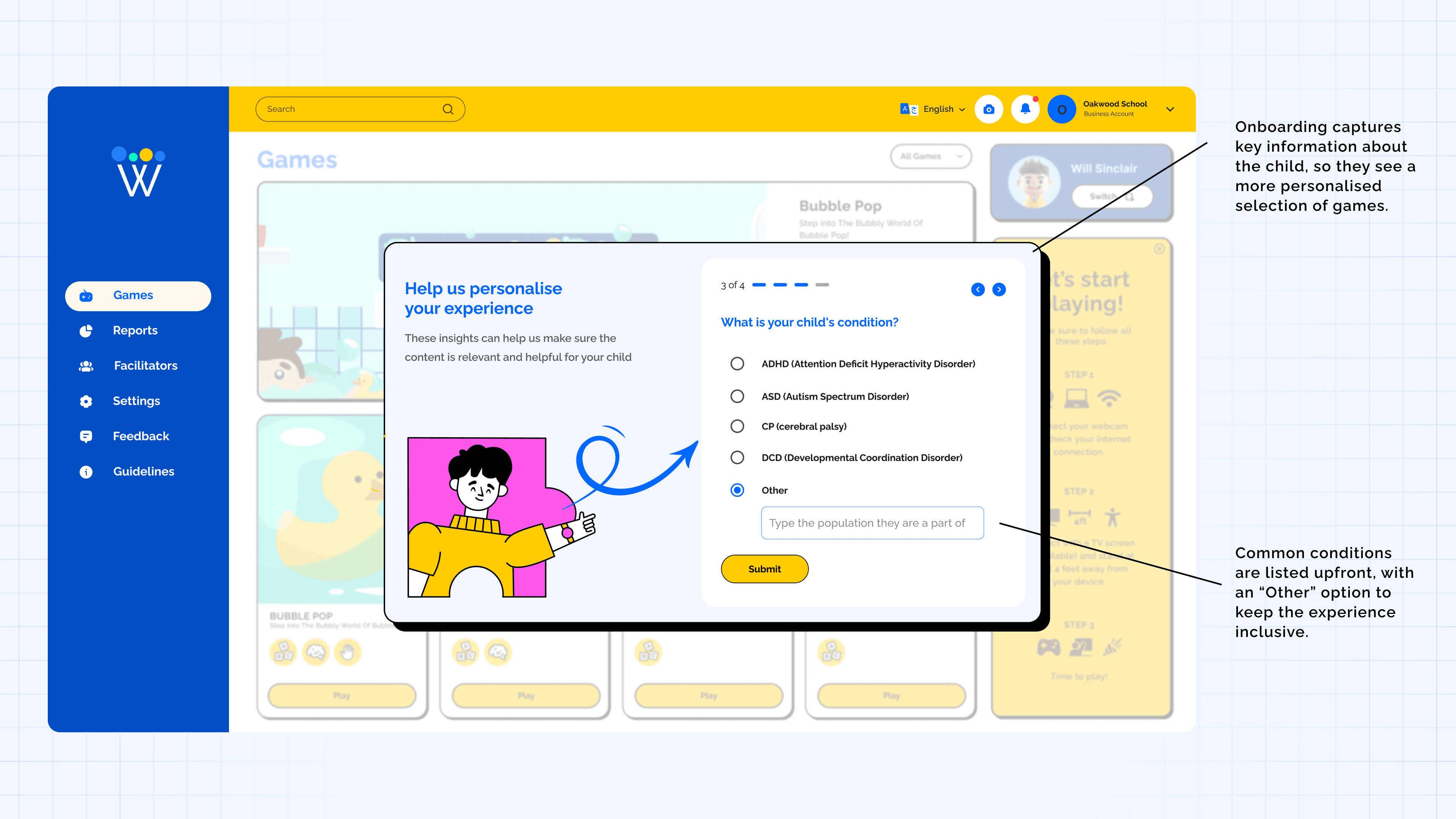
Once users signed up, I wanted the product to feel relevant from the start rather than dropping them into a generic experience.
I introduced a short onboarding flow that captured the child's name, age and condition, creating a more personalized starting point for the games and experience.
Removing the friction before first play
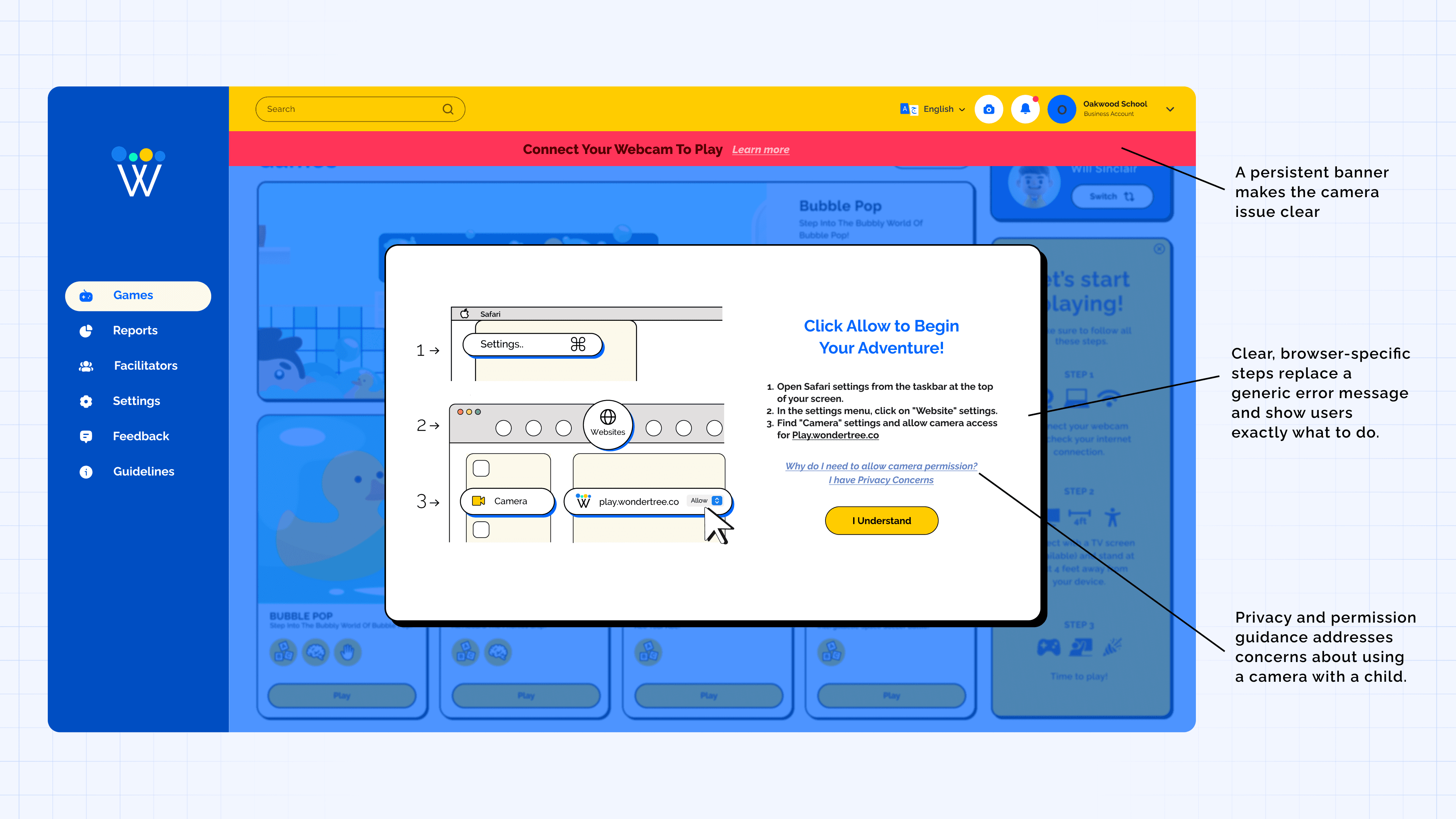
One of the biggest barriers after sign-up was setup. If the camera wasn't connected or users didn't understand how the physical setup worked, the journey could stop before they ever played.
I redesigned the setup experience with clearer instructions, contextual guidance and recovery states so users always knew what to do next.
After the redesign
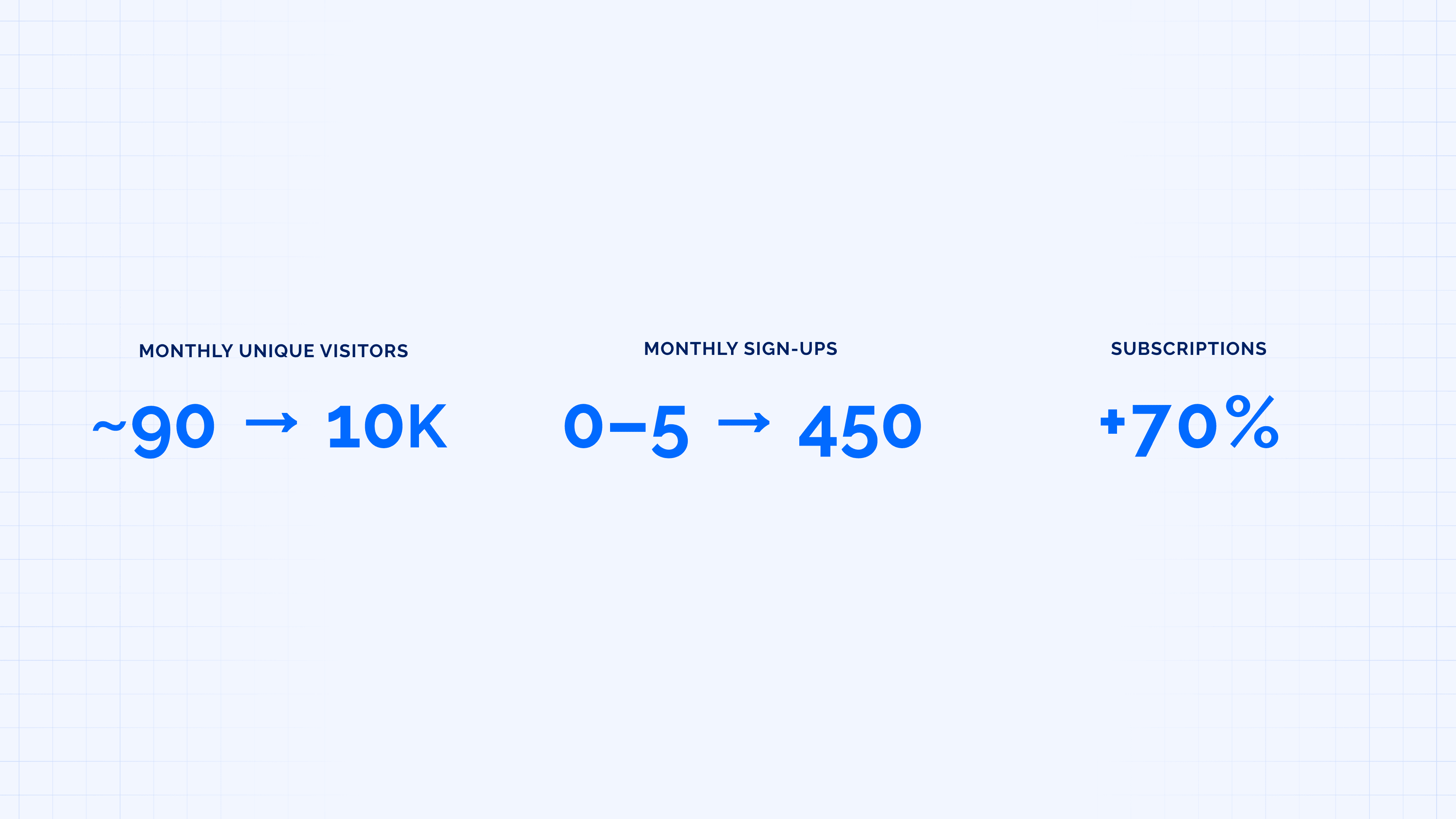
The result was a clearer path from discovering WonderTree to actually using it.
tools
Figma
team
Sobia Iqbal Farooqui, Samar Iqbal
01
02
03
04
05
see also